Retro-Review: Advanced Dungeons & Dragons Trading Cards (1991)
As I was researching creature cards for my own “Creature and Encounter Cards” Kickstarter, I remembered a long time ago I picked up a boxed set of then-TSR’s “Advanced Dungeons & Dragons 2nd Edition Trading Cards.” To be blunt, they were so bad that I think I just looked at a few, didn’t like them and kept them in the box ever since.
First, the few good points:
- Most of the art is very good. (However, there are a couple of big caveats to that below.)
- The monster card backs contain almost exactly the information I’d want on the cards. The item cards backs are good too. The NPC cards need more detail (and have space for it) but overall the card backs are good.
- The set is pretty comprehensive. You got 750 cards for $25. Even in today’s dollars that is likely $60-$75. I could nit-pick that point and say it is possible to do 750 monster cards alone, but that is a good value.
And now the bad:
- Most of the art is reused. I know art is expensive, but this is TSR before many RPG players were moving to Magic the Gathering. I wouldn’t expect TSR to reuse the art to such a degree.
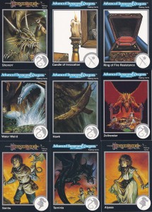
- If you’re going to reuse the art, they should have tried to do a better job of cropping other figures out. For example, in the picture with the “Shonorr” card, cut the person’s arm and leg out and touch up the image. If the touch up is too difficult for a staff artist, don’t use it.
- You can see that one painting is occasionally cut up into the art for several cards. (See the bottom three in the image.) Again, I can see some reuse… but why are two used for DragonLance characters and the other is generic AD&D2e?
- The art that isn’t reused is much lower in quality. I can see skimping on some of the less interesting things such as items (see the “Candle of Invocation” in the picture) but the set has this art style for other, non-item cards such as the Mummy, Displacer Beast, and Kobold cards among many others..
- The ordering of the cards is mystifying. The cards pictured are #37-#45, which would put them all on one sheet of a baseball card page. Why does it have a mix of items, named monsters, generic monsters and a couple of NPCs?
- Sticking with the prior point, why are some cards from DragonLance and some from generic AD&D2e next to each other? Further if you lay the cards out into 9 card pages, some pages have a mix of 3 different types.
- Even in a few cases where they get the above 2 points correct (Card #481 starts with a set of 9 Ravenloft NPCs in a b&w art style) the first card in the series is the 4th card on the page, so they don’t fit nicely on one page! (The three cards before are Forgotten Realms; the cards after are 4 AD&D2e, then a single Greyhawk card, then back to AD&D2e.) Sort them into groups of creatures, NPCs, and items; then second sort alphabetically or by setting. Or sort them by setting first then by groups for creatures, NPCs, and items. Even better would be to do a base set then add on sets for the different settings.
- The art has a border inside the card border. At the time I believe cards couldn’t be made full bleed, but why add another 1/8″ silver border within the overall nearly 1/4″ border. (Even the 1/4″ border may have been more than standard at the time.)
Sorry if the above is very negative, but the set could have been so much better! I’m overflowing with disappointment more than anything else.
For my project we’re planning on themed sets of creatures where one set of 54 cards is humanoids & fey while another set is undead, constructs & outsiders and so on. The combination of groups is determined by how similar are the groups and how do we best group them to get sets of 54. (There are manufacturing reasons to do sets of 54.) Within the set we’ll either go alphabetically or by subgroup (humaniods, then fey for example) then alphabetically. Some of the art will be reused but none of it will have been used nearly as prominently as much of the art in the TSR set.
I seem to recall reading in Dragon magazine at the time the mix of the cards – including the mix on the sheets – was designed that way due to rarity (If you didn’t buy the factory set but collected them the old school way) and production of the packs. Simarly, the inner border had different colours according to rarity.
The “starting the mini-series on the wrong number” thing came from them simply not knowing about how cards are stored in binders. The response to the complaints about the mini-series alignment problem included “we were wondering why they were always nine cards long.”
IIRC,the problem was fixed in the later sets.